Envisioning user experience for semi-autonomous ebikes
Overview
As a part of the Interaction Design course at Carnegie Mellon University, I designed user experience for conceptual semi-autonomous ebikes, including mobile app and dashboard interfaces and a physical prototype.
Time
2024.10 - 2024.12 (12 weeks)
Team
Alyssa Ogle
Ryan Nuqui
Summary of My Role
As the lead product designer, I led the team in conducting user research and task analysis, as well as designing the physical and digital prototypes.
Problem Statement
As autonomous driving is increasingly adopted in public transportation, we set out to envision concepts and paradigms for Level 3 semi-autonomous rental ebikes.

At level 3 on the autonomous driving scale, an ebike should be capable of performing most riding tasks autonomously under specific conditions, such as maintaining balance, adjusting speed, and braking, but it still requires the rider to intervene when necessary. Based on our preliminary research, we decided to focus on designing a ebike rental experience for commuters.
Read the full design brief here.
User Research
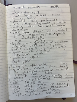
Conducting guerilla research at a local ebike rental spot revealed that commuters care most about efficiency and minimal distractions when using ebikes.
Key Insights
Emphasis on Efficiency
Users were choosing ebikes over other forms of commuting – walking, going on the bus, regular biking – because they were faster. This prompted us to focus on how we could optimize efficiency and speed within the ebike's user experience.
Design for Minimal Distraction
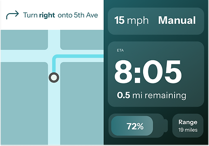
Users have little bandwidth to interact with screens while riding, so it’s essential to create a streamlined display that clearly communicates the information users need. Participants informed us that battery status and estimated arrival time are the most critical information they need.
Conceptualization
I worked closely with the team to conceptualize the product through a series of analytical and creative processes, taking into account the integration of digital and physical components.
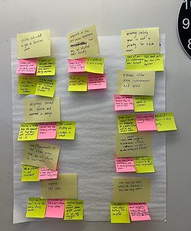
Task Analysis
We sorted out the most important tasks (e.g. avoiding collision) for our users, then created a flow diagram for each task.

Rapid Ideation
We generated ideas that could help users complete their tasks, e.g. a vibration warning on handle bars to alert users of upcoming collisions.
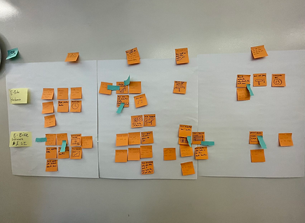
Thumbnail Sketching
We sketched out ideas that are most closely aligned with user tasks.
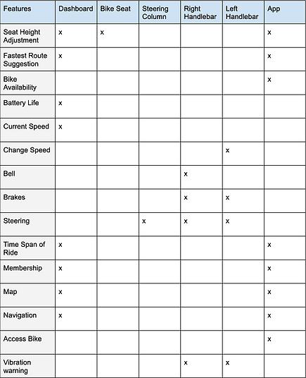
Functional Cartography
We mapped out where each function will be located on the bike.
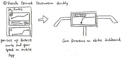
Concept Poster
We brought all ideas together and explained how the conceptual product works.

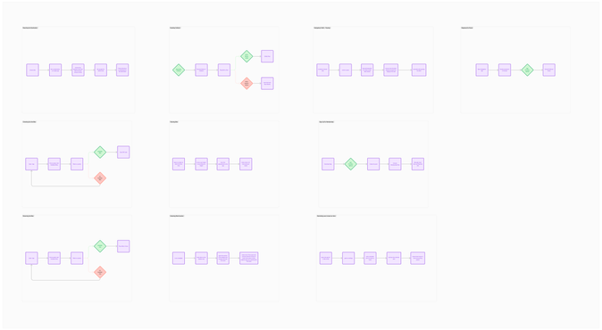
User Flow
The circular user flow diagram illustrates how the app and the vehicle control work together to fulfill the commuter's experience.

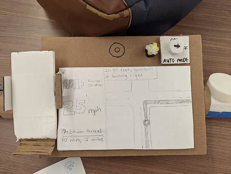
Paper Prototype
To evaluate the initial concept, I created a paper prototype and conducted Wizard of Oz testing to gather user feedback.
Key Findings from User Testing
Confusing Auto Mode Dial
The auto mode switch's label, "Auto Mode", was often mistaken as a state, and users would the turn the dial to the label to activate auto mode.
Overwhelming Functionality
Users found the bike’s functionality overwhelming, prompting the need for a clear instruction manual.
Navigational Display Issues
The display’s information was confusing and misaligned with user priorities.
-
Participants valued estimated time of arrival (ETA) over speed, but the visual hierarchy didn’t reflect this preference.
-
Navigation instructions were too wordy for the brief glance time available.
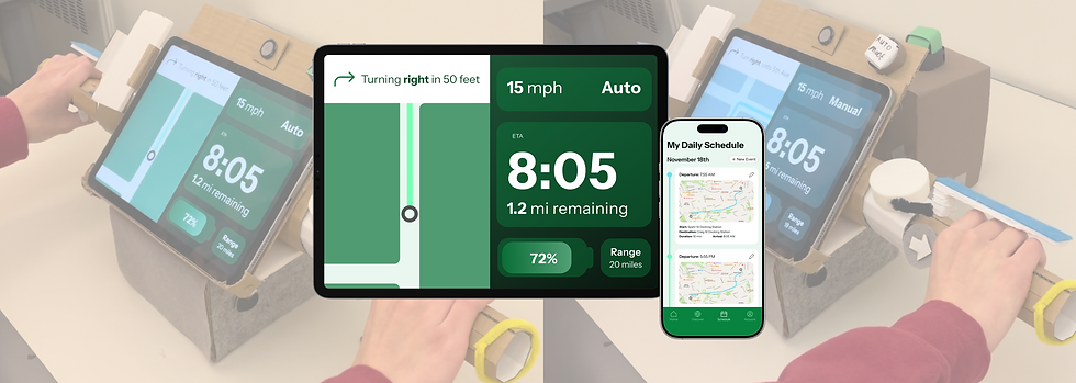
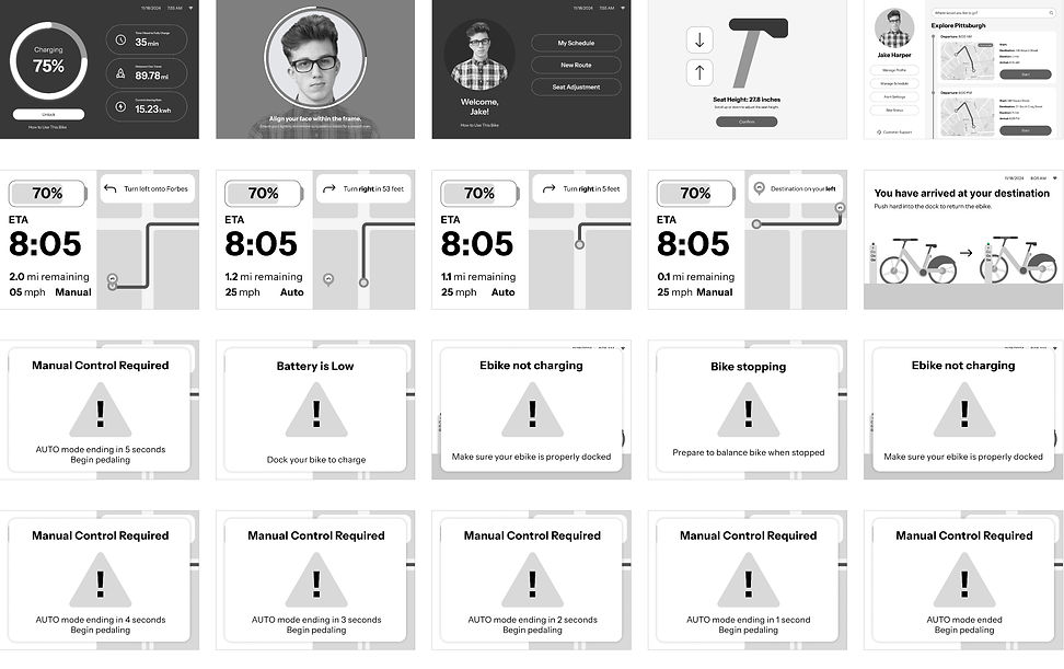
Low Fidelity Prototype
I developed low-fidelity prototypes for the mobile app and vehicle control dashboard, incorporating key user feedback to address usability and functionality needs.

Design Iterations
Through multiple rounds of user feedback and professional design critiques, I refined the visual design to make our prototypes more clear, intuitive, and user friendly.
Applying Law of Proximity
Placing the auto mode state in the top-right corner of the screen, right beneath the auto mode button, helps the user understand its purpose.

Using Color to Illustrate State
Using distinct color schemes for auto mode and manual mode makes it easier for users to quickly identify the current state.
Streamlining the Onboarding Experience
Simplifying the standalone user instruction manual and integrating key instructions into the standard user flow significantly eases the user's learning curve.


Differentiating Pop-up Messages
Designing distinct styles for various pop-ups improves clarity and prevents confusion.


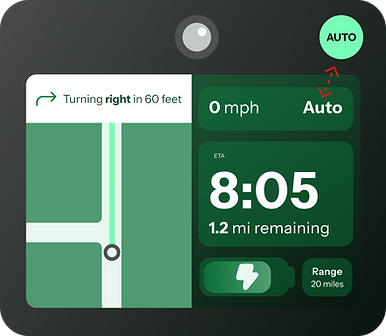
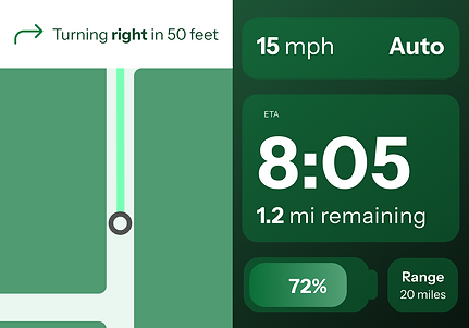
Final Design
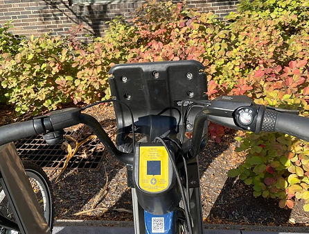
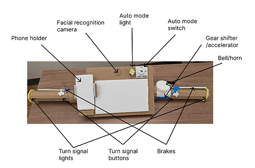
Physical Prototype

Mobile App

Dashboard

Video Demo
The video below demonstrates dashboard and vehicle control interactions when the user is riding. View more video demos here.
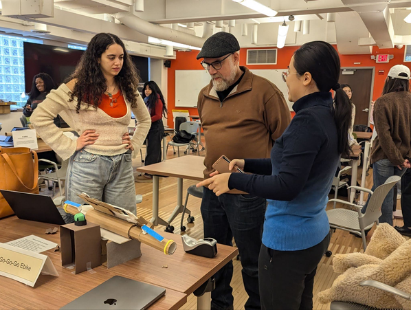
Project Showcase
We showcased our final design at a Science Fair with industry experts and received positive feedback from participants.